How to choose right visual for Data Visualization in Power BI ?


Data visualization is a crucial aspect of any business or organization, as it helps to present complex data in a more understandable and visually appealing way. It enables decision-makers to quickly understand trends and patterns in the data, which can help to inform their decisions and strategy.

One of the key tools for data visualization is Power BI, a powerful software platform that allows users to create interactive dashboards and reports. When using Power BI, it is important to choose the right visual for your data, as this will help to effectively communicate the insights you have gleaned from the data.

So, how do you choose the right visual for your data visualization in Power BI? Here are a few key tips:

1.     Know your data: Before you start creating your data visualization, it is essential to understand the data you are working with. This includes understanding the structure of the data, the types of data you have, and any relationships or patterns in the data. Understanding your data will help you choose the most appropriate visual for presenting it.

2.     Determine your objective: What is the goal of your data visualization? Are you trying to show trends or patterns in the data, or are you looking to compare different data sets? Knowing your objective will help you choose a visual that is most suited to achieving that goal.

3.     Consider the type of data: Different types of data lend themselves to different types of visuals. For example, if you have categorical data (data that can be placed into categories), a bar chart might be a good choice. If you have continuous data (data that can take on any value within a range), a line chart might be more appropriate.

4.     Think about your audience: Who will be viewing your data visualization? Is it for a general audience, or for experts in a particular field? The level of understanding of your audience will affect the type of visual you choose.

Here are a few different types of charts available in Power BI, along with the types of data and objectives that they are most suited for:

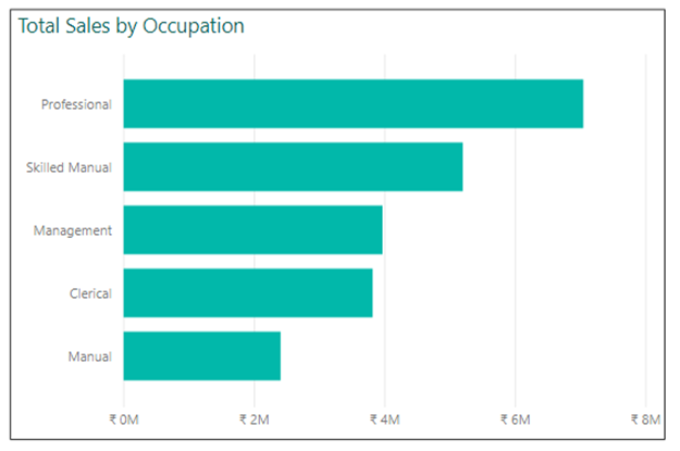
1.   Bar chart: A bar chart is a great visual for showing the proportions of different categories within your data. It is especially useful for comparing values between different categories.


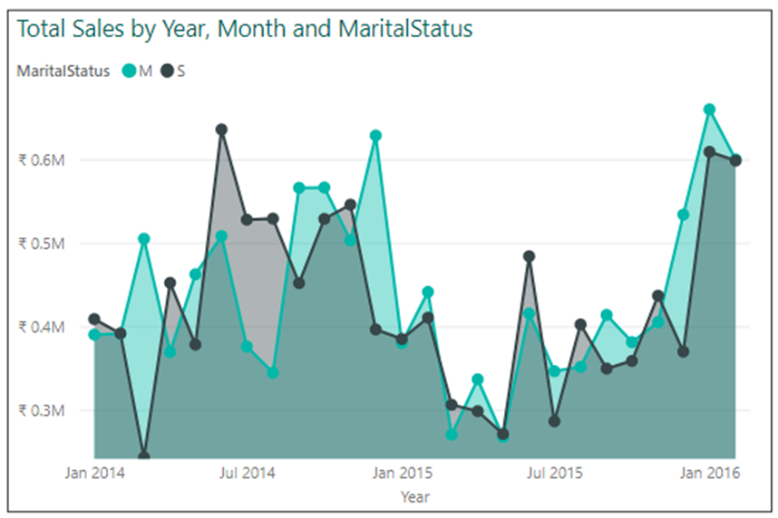
2.     Line chart: A line chart is a good visual for showing trends and patterns in continuous data over time. It is especially useful for showing changes in data over a period.


3.   Area chart: It is similar to a line chart, but the area between the line and the x-axis is filled in with a color or pattern. This can help to show the magnitude of change over time or between categories.

4.   Scatter plot: A scatter plot is a great visual for showing relationships between two continuous variables. It is especially useful for identifying patterns and trends in data.

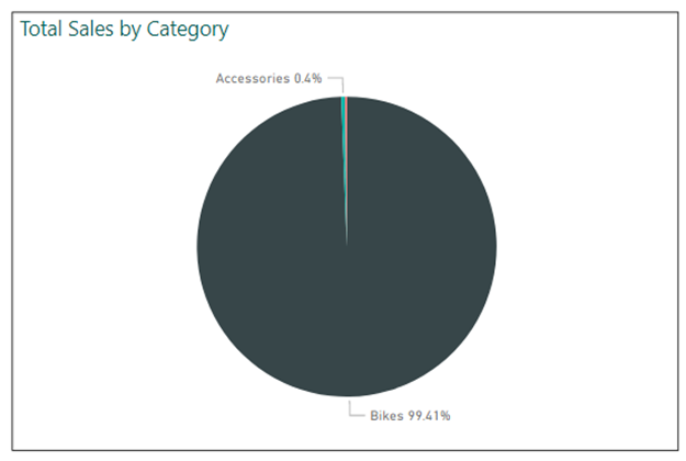
5.   Pie chart: A pie chart is a good visual for showing the proportions of different categories within your data. It is especially useful for showing the relative sizes of different categories within your data. Tip: Do not use Pie Chart if the categories are more than 5, use a bar chart instead.

6.   Map visual: A map visual is a great visual for showing geographic data. It is especially useful for showing the distribution of data across different regions.

7.   Stacked bar chart: A stacked bar chart is a good visual for comparing the proportions of different categories within your data. It is especially useful for comparing values between different categories over time. You can use a 100% stack chart to view the percentage contribution of each country and use sales in tooltips.

8.   Side-by-side bar chart/Clustered Chart: A side-by-side bar chart is a good visual for comparing the values of different categories within your data. It is especially useful for comparing values between different categories.

Some examples of when to use a side-by-side chart or clustered column chart include:
  •     Comparing the sales of different product lines over time
  •     Displaying the results of a survey or poll, with each data series representing a different response option
  •     Visualizing the performance of different teams or departments within an organization
  •     Comparing the performance of different market segments or customer groups.

In conclusion, there are many different types of charts and visuals available in Power BI, each with its own unique features and characteristics. By understanding your data, determining your objective, considering the type of data you have, and thinking about your audience, you can choose the right visual for your data visualization in Power BI.

Comments

Popular Posts